
About the list: Don't judge a book by its cover. So the saying goes. But, this is not true for album covers. An album cover should correspond with the music and thereby constitute an indivisible whole. Here are ten album covers that doesn't live up to these high standards. In fact, some of the album covers are quite hideous. None of the albums on the list are particular important in the genre. It gives some consolidation.
|
No |
Cover | Album | Artist |
Notes |
|
1 |
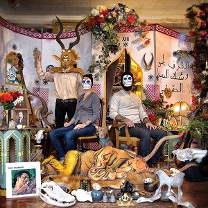
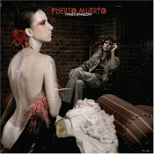 |
I Was A Swallow (2008) |
Puerto Muerto |
This is the winner by a long way ahead. Is it art or arty farty? I’m inclined to go for the latter interpretation. The layout and design was made by James Nicholls. The band bears full responsibility for not saying no to this. |
|
2
|
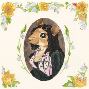 |
The Owl and the Bat and the Bumblebee (2011) |
The Roe Family Singers |
Their debut album is placed as no.10 on the list of the 10 best album covers in the gothic country genre. What happened? The drastic change in album cover rating is linked to a change to family-friendly music. |
|
3
|
 |
Tough Titty (2005)
|
Adult Rodeo |
Stylized letters is a classic. But these letters fail on an epic scale. Beige-brown colors, spongy structure and ugly letters. Everything is wrong with this album cover. Adult Rodeo is to blame. |
|
4
|
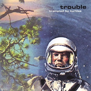 |
Trouble (2007) |
Trampled by Turtles |
An album cover and the accompanying music should have a strong connection. What possible link is there between an astronaut and “bluegrass”? No connection at all. The album cover was designed by Veti Design. |
|
5
|
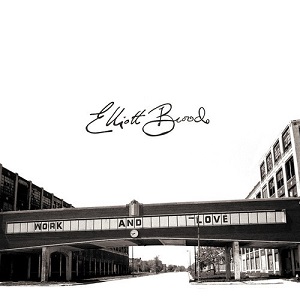 |
Work and Love (2014) |
Elliott Brood |
Is this a cover to the Architectural Record or an album cover? It’s hard to say. After “Ambassador” and “Mountain Meadows” Elliott Brood took the wrong turn and this is what happens. Unforgivable. |
|
6
|
 |
Last of the Country Gentlemen (2011) |
Josh T. Pearson |
The album came as a result of a relationship that the artist described as "pretty heartbreaking". The album cover is really over-the-top. One should always try to save some dignity for the future. |
|
7 |
 |
Fits of Reason (2013)
|
Brown Bird |
This album cover seems to have been inspired by Sgt. Pepper's Lonely Hearts Club Band. However, the album cover is overburdened and too messy to function. The artwork and layout was made by William Schaff. |
|
8
|
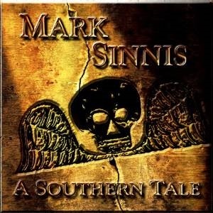 |
A Southern Tale (2009) |
Mark Sinnis |
I have nothing against skulls, but this looks like the Phantoms "Skull Mark". It leaves a scar of the corresponding shape on the enemies he punches with it. The ring was given to the first Phantom by Paracelsus. |
|
9 |
 |
The Brave and the Bold (2006) |
Bonnie 'Prince' Billy |
Someone picked this album cover for the list “Nice Cover Artwork” on Discogs. It wasn’t me. The painting is made by famous artist Woody Crumbo. It doesn’t matter when it doesn’t fit the music. |
|
10 |
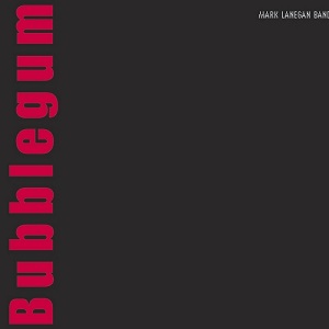 |
Bubblegum (2004) |
Mark Lanegan |
Is this a business card from a recently started PR company or an album cover? It’s hard to say. It doesn’t fit the music and it’s very boring. Art Direction & Design by Susan McEwoen. |